Mapping Inequality: Eurocentrism in Mercator Projection
-Oishee Bose
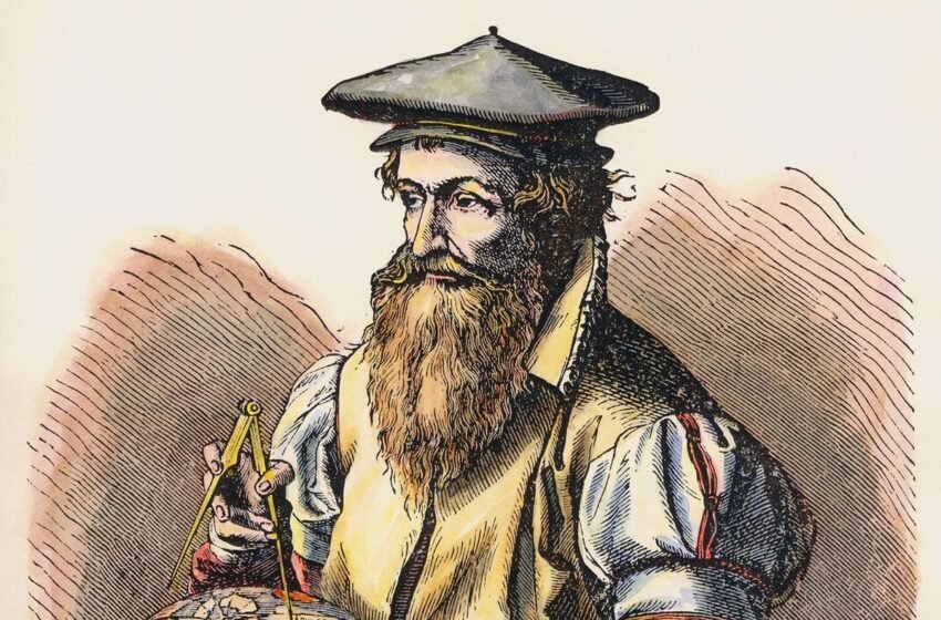
Maps often seem reliable because they offer a clear and organized image of the world. A classroom map, a folded atlas, or a phone map seems to offer an objective view, and that appearance encourages people to accept what they see without asking why it looks that way. Transforming the round Earth into a flat image forces choices about what to preserve and what to distort, and those choices matter more than what most of us realize. The projection created by Gerardus Mercator in 1569, solved a real problem for sailors and explorers, and it did so brilliantly. Navigators could plot straight lines representing constant compass headings, which made long voyages easier to plan and to complete. Over centuries the map that was originally a practical navigational tool became a standard picture of the world in classrooms and media, and that adoption carried unintentional cultural consequences.
What Eurocentrism Means in Maps
Eurocentrism is a pattern of thinking that treats European experience as the standard or the default measure of importance, progress, and culture. In visual terms this pattern shows up when maps place Europe at the centre of attention, when they use colonial names instead of local ones, or when they display the world in ways that make European and northern countries appear larger and more central. Those visual cues are subtle, and yet repeated exposure to the same visuals can influence how whole generations imagine the global order.
How the Mercator Projection Works and What It Sacrifices
The main strength of Mercator Projection is, that it preserves angles, and that property made it invaluable for navigation. A straight line on a Mercator map corresponds to a constant compass direction, and that fact allowed sailors to follow steady courses without constant recalculation. Preserving angles comes at a cost, and that cost is area. As latitude increases away from the equator the Mercator map stretches distances and areas more and more. The farther North or South a place is located, the larger it looks on the map. Near the poles, the distortion becomes extreme.
A clear example of that effect is the way the map renders Greenland and Africa. Africa covers about 30.37 million square kilometers, and Greenland covers about 2.16 million square kilometers. Africa is roughly fourteen times larger than Greenland, yet on many familiar Mercator world maps, Greenland looks similar in size to Africa.
Another comparison is that of Europe and South America. Europe covers about 10.8 million square kilometers, and South America covers about 17.84 million square kilometers. South America is therefore, much larger in area than Europe, and yet many Mercator maps make Europe appear the size similar to South America or even larger depending on how the map is framed. These visual misconceptions influence how students understand global geography and power.
How Centring Reinforces Perceived Importance
Maps are rarely presented without a centre, and what occupies the centre draws the eye and gains perceived prominence. Traditional classroom maps printed in Europe and North America often placed Europe near the centre of the page and the Atlantic in a prominent position. That choice reflected the needs and preferences of mapmakers and audiences at the time, and it also mirrored political and cultural priorities. The same map could easily be recentred on the Pacific or on Africa, and the world would feel different to viewers. The continuity of European centring reinforces a habit of thinking that sees Europe as a focal point rather than as one region among many.
How Historical Use Spread the Projection’s Visual Grammar
The Mercator projection became a dominant image during the era of European maritime expansion. European countries that were deeply involved in ocean travel also controlled major printing presses, publishing networks, and education systems. The navigation friendly map therefore travelled alongside colonial authority. As European powers printed atlases and exported textbooks their preferred images of the world reached schools far beyond Europe. In colonized regions students learned geography from the same maps that Europeans used, and that shared visual vocabulary carried the same distortions and naming conventions across continents.
How Distortion Maps onto Global North Dominance
The Mercator projection enlarges territories at higher latitudes, and that enlargement tends to place northern industrialized countries into visually dominant positions. Russia and Canada really are geographically large, and yet the Mercator stretch makes them look even larger relative to equatorial countries than the raw numbers would suggest. Many northern European nations appear disproportionately big next to African and South American nations. That visual hierarchy coincides with real world distributions of economic and political power and produces an image in which northern states seem to occupy most of the map’s space.
How Naming Choices Add Another Layer of Bias
Maps do not only represent shapes and sizes, they also label places and draw lines between them. Colonial mapmaking practices often replaced indigenous place names with European ones and drew borders that matched administrative needs rather than local realities. Those naming and boundary choices layered a political interpretation onto the raw image of territory. By creating European names and administrative divisions, maps helped to naturalize the political logic of colonial control, and those inscriptions lasted long after formal empire ended.
The Web Mercator Effect and the Digital Era
Digital map services adopted a variant of Mercator because it works cleanly with the tiled systems that enable smooth zooming and panning. That practical choice brought the Mercator visual grammar into daily life for billions of people. Regular exposure to such maps affects mental models of geography. Studies that examine perception show that people who spend a lot of time with Mercator style maps are more likely to misjudge the relative sizes of countries and to underestimate the area of equatorial regions. Habitual use makes the distortion into a kind of second nature.
How Misperceptions Appear in Education
Many students grow up thinking Greenland is almost as large as Africa and that Europe is among the world’s largest continents. Those impressions are not random mistakes, and they are tied directly to the way the Mercator projection displays relative size. As classrooms repeatedly show a distorted image, students internalize the distortion rather than recognizing it as a representational choice. Instruction that clearly discusses the inconsistencies in different map projections can help correct widespread misunderstandings about world geography.
Alternatives and Their Trade offs
No single flat map can show all properties of the globe perfectly. Each projection sacrifices accuracy in at least one dimension to preserve utility in another. Equal area projections keep the relative sizes of places accurate, and that feature makes them better suited for discussions of resource allocation population and true spatial scale. The Gall Peters projection rose to prominence because of this reason — it restores accurate proportional area and thereby, challenges the visual minimization of equatorial continents. Newer projections such as the Equal Earth projection attempt to preserve area while also keeping shapes fairly recognizable. These alternatives offer possibilities for more balanced visual representation, and they are most effective when used alongside other projections in educational settings.
Drawing the line
A flattened map is not a neutral window onto the world; it is a crafted argument about what matters and where power looks biggest. The Mercator projection solved practical problems for navigation and served those needs admirably, and yet the same projection became a familiar image that made northern and European regions look larger and more central than they are in reality. That visual emphasis has reinforced Eurocentric habits of thought and has affected what students believe about geography and importance. Recognizing the role of projections in shaping perception does not require rejecting Mercator entirely, and it does not pretend that a map alone creates global inequalities. Recognition invites a different response. Educators and citizens can teach and learn multiple ways of seeing the world. They can show how size and shape change with projection and how names and borders carry histories inside them. Doing this simple work equips people to read maps critically and to see that the world on the wall is a conversation about who counts and who is counted rather than a final statement of truth.
On examination, if the world looks different from the maps we have used for generations, then that discovery has two consequences. It challenges comfortable assumptions about normality, and it opens a path to more honest visual education. Maps will always be tools with trade-offs; the important question is who chooses those tools and how much the public is aware of the choices. Learning to read projections is a small democratic practice that helps people see beyond an inherited picture and imagine a world represented more fairly and more accurately.